

Brand identity · Concept · 2026
HALVØ
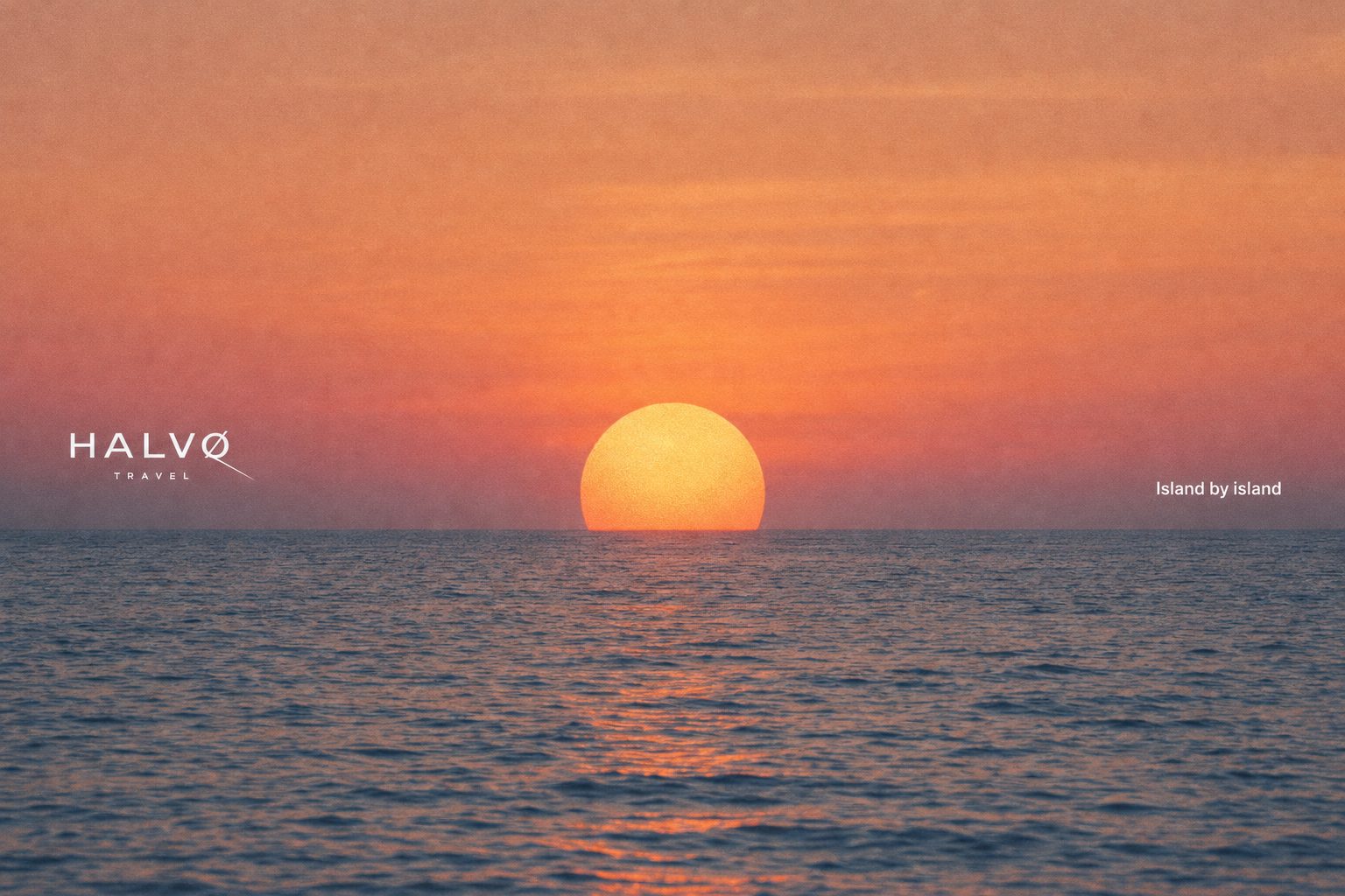
Island by island.
A travel brand drawn with one line: the wake a ferry leaves behind.
HALVØ (Danish for 'peninsula') is a self-initiated identity for a boutique ferry and island-travel company, made to show how we build a brand system from the first mark to the last ticket.
The wordmark is a wide geometric grotesk. The slash through the Ø runs out as a ferry's wake, and that one line becomes the signature on everything from cards to flags.
The palette is Baltic blue, sun yellow, mist and pine: the sea, the summer, the fog and the islands.
The mark
HALVØ in wide caps. The Ø's slash keeps going, like a wake on calm water.
- Baltic blue#1F4E8C
- Sun yellow#F2C14E
- Mist#EEF1F2
- Pine#2F5D50
- 01WordmarkHALVØ / TRAVEL
- 02Wake markØ in a circle
- 03StationeryCards, letterhead, tickets
- 04Merch & wayfindingCaps, mugs, flags
Applications
From the captain's card to the boarding pass: one line, one blue, one yellow.
Business cards in Baltic blue, set in hard morning light.
On board
The brand where it lives: on the quay and on deck.
Campaign
Island by island: a slow-travel line for the long Nordic evenings.
Next step
Want a brand identity like this?
Keep going